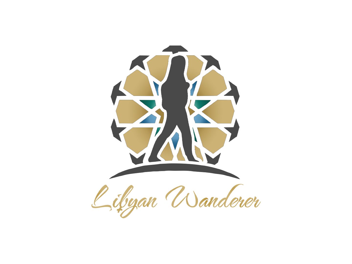
The LOGO is here!
Finally, after surviving the first year on the new website for the blog, I decided to make a few changes that could enhance users’ experience—choosing to finally have my own website/blog to share my work. After spending years on Blogger and being active since 2017, it wasn’t an easy decision to make a move. Although it may sound easy, it is a more significant commitment. I started the process of this move while going through physical movement multiple times during 2020, so it may have been easier.
Since launching in 2021, you may have noticed a different header if you have been following the new website. Looking back, I think I was still attached to my blog on Blogger. I felt that I had to remind myself about the old space and its feelings. So much was happening with the big move, adjusting my activity to be different but better and well-structured—the web designing process managed by a dear friend of mine. His help and support made adjusting to the new website easier.
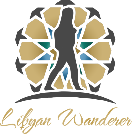
This year, I realized that the header no longer matches the website title ”Libyan Wanderer”. When I decided to change the header, I knew my attachment with the old blog was over. Everything takes time to adjust. For the adjustment, I wanted the new logo to represent me and the vision I hold for blogging. Therefore, I reached out to an artist and game developer, Majd Wolf. I discussed the process, shared my thoughts with him, and he agreed to design a logo for the blog.
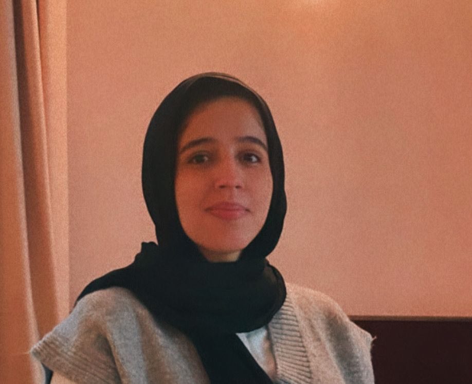
The logo you now see represents all the elements linked to my connection with writing. The colors and shapes have meanings. For instance, Majd added a replica portraying me as the wanderer behind this blog. Also, the figure behind it is inspired by the tiles of the old city of Tripoli. It is the place that ignited my passion for writing and discovering the history of my home country, Libya. For the colors, the shades of blue represent the colors of the Mideternean sea. While green represents prosperity and hopefulness, it also represents the calmness of the countryside.
Thanks to Majd, the logo came out better than I expected and the follow-ups were enjoyable, and he considered every comment and note I made. Finally, I feel that the website logo represents this space and the stories it holds. I hope you like it as much as I love it because this will stick around for a while. Stay tuned for more modifications on the website!
You can check the work of Majd Wolf: ArtStation – Majdf Wolf
